What Are We Trying to Solve?
Technology moves fast, and as much as we try to make things simplified older generations have struggled to maintain the same connectivity that they once had. With the pandemic shutting down in-person events, returning back prioritized work places and schools’ which left older adults in a limbo on how to meet again.
We were tasked with creating a solution for older adults traveling in a post pandemic world that would create a meaningful experience. So what type of things would we need to consider?
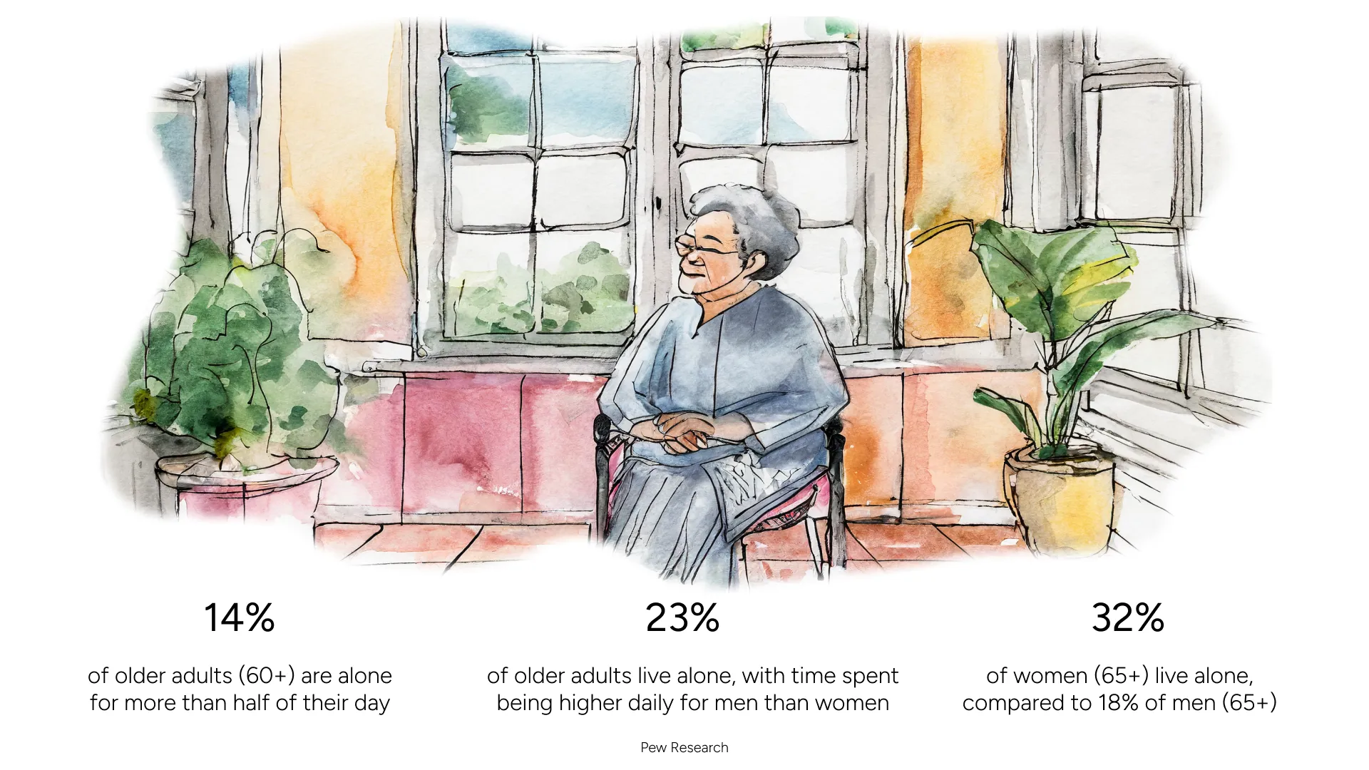
With their living situations impacting their ability to see others on a regular basis, our team decided to see what other barriers could be hindering their ability to meet with others and travel.
What barriers are stopping our users?
Due to our rather quick timeline, we focused on generating findings through secondary research and found three core factors to consider:
- How would being immunocompromised affect my ability to travel?
- Will I be able to financially afford the trip?
- How could I connect with others in a genuine way again?

These core findings aided in developing our user stories.
- As an immunocompromised adult, I want to know what COVID precautions will be taking place prior to booking an expensive trip so I can avoid becoming sick.
- As an individual with a pension/fixed income, I want to know of different ways that I could save money on my travels so that I can find affordable options to travel.
- As a 65 year old user, I want to find a fun way to travel with others so I can create meaningful experience with people I know.
But these stories don’t work independently
While we often talk about intersectionality in conversations around systemically oppressed identities, its key idea of compounding barriers to entry apply here as well.
If our users aim to connect with one another through a trip and one of them is limited financially while the other physically, their ability to travel together becomes significantly harder.

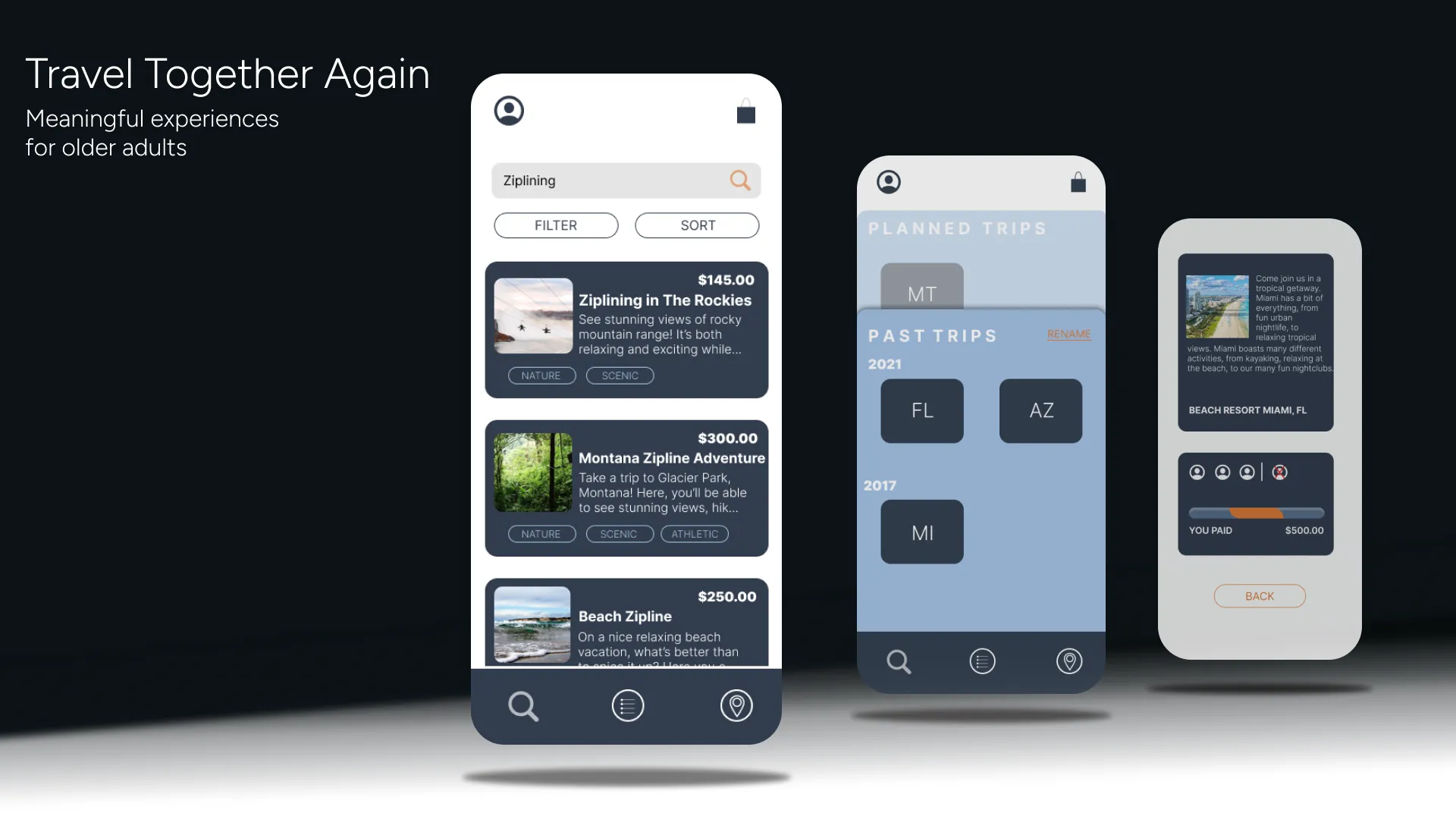
Key Features
- A quiz to provide users with recommended trip ideas
- Once a trip is selected, users can share them with friends through a text to invite and split the cost of the trip
- An accessibility FAQ within the trip card that showcases the local COVID protocols, physical accessibility information and nearby hotels
These features would prioritize generating affordable search results for our users with the ability to share and receive the accessibility information they need prior to booking a trip.

Deliverables: 3 Fidelity Prototypes in 10 weeks
In our 10 weeks, we built 3 prototypes: paper, midfidelity, and high fidelity. Our class collectively aimed to complete this project in 9 weeks, staggering our prototype fidelity with one every 2 and half weeks, with the last week reserved for final presentations on our respective solutions.

After completing our paper prototype we tested with our peers, ages 19–24, understanding where our large pain points lie. Our main finding was not enough connectivity to a home section. We re-iterated in our mid fidelity and high fidelity, testing each of these with four adults ages 53 and up.